We’ve all done it. We search for something all over the place – and then discover it’s been right under our nose all along.
This is pretty well the story of the AGO’s revised logo, according to Steve Rayment (Director, Marketing, Design & Publicity), who presented the winning choice at the February 21 Town Hall meeting for staff and volunteers.
In January 2012 the AGO began looking for a way to update the logo; over the following months they talked to agencies and designers (including the Bruce Mau people, who designed the existing logo); they considered many, many possibilities; and then…
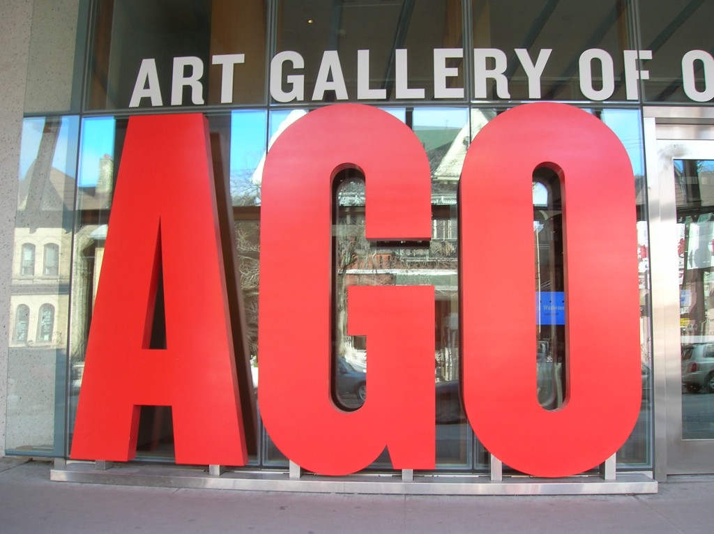
“And then we found the answer, right outside our own front door!” said Steve, shaking his head and laughing. “There it was – already announcing us to the world, already a favourite of countless visitors who get their picture taken beside it.”
It’s not only right there; it’s right for our needs in a lot of ways.
- It’s an evolution, not a dramatic change – it uses the existing letters, but lifts them out of the black box.
- It can be used large or small, from business-card size to big publicity banners and everything in between.
- It’s simple and strong. In advertising and publicity, says Steve with obvious satisfaction, “It allows us to own the page.”
- It’s adaptable. “The standard red logo will be the base image, but we can add information lines for different purposes, and integrate it with other AGO signage.”
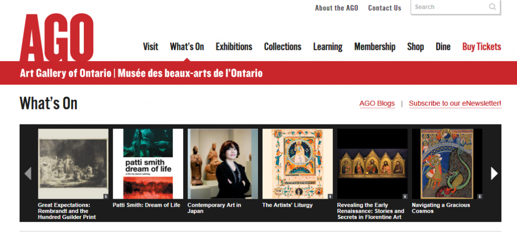
For example… here it is on the AGO website:
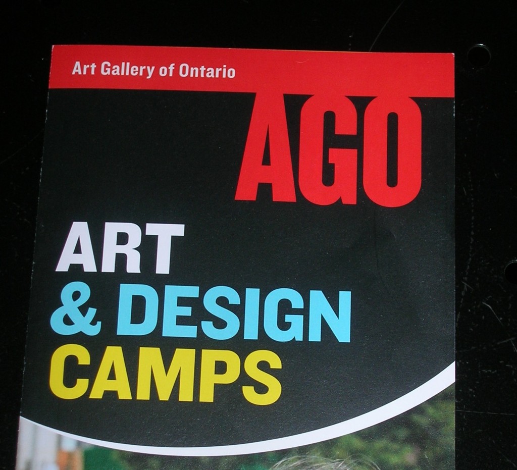
And here, on one of our newest pamphlets:
Within a few months, the new – no! the evolved – logo will be completely phased in.
And to think it was right there in front of us, all along.


