In these summer months of tourist season, Foyer suggests some sightseeing, past and present
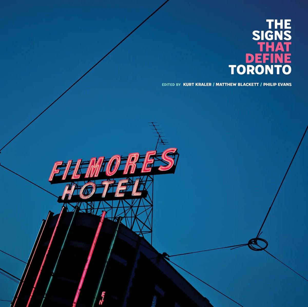
Like any city, the look and feel of Toronto’s urban landscape has changed drastically over the years. In the haste of rapid development, important opportunities to document the cultural history of a city are often missed. Recently, ERA Architects in partnership with Spacing magazine seized such an opportunity via a deep dive into the history of Toronto signs – in the form of a brand-new book.
ERA partner Philip Evans and architect Kurt Kraler have teamed up with Spacing’s Matthew Blackett and 20 other contributors to publish and produce The Signs That Define Toronto. Adorned with striking vintage photography, the book explores the rich and diverse history of Toronto signage, using it as a lens to better understand the city’s ever-evolving identity.
AGO’s Foyer writers spoke to Blackett and Kraler to learn more about the inspiration behind the book and asked for their insights about the present and future of Toronto signage. Read the full article, HERE.
Want to subscribe to Foyer, for art stories inside (and outside) the AGO. Sign up, HERE.